A great way to test the success of a digital service is to observe real users making their way through it. This week, we’ve been doing just that with our new, simplified volunteer recruitment journey.
We asked five participants who recently went through the existing process to try out our improvements. In a semi-structured interview format, we watched how they got on, asked questions and explored any issues they had in detail.
We ended up with a range of observations for each page in the new online service, recorded on post-it notes:
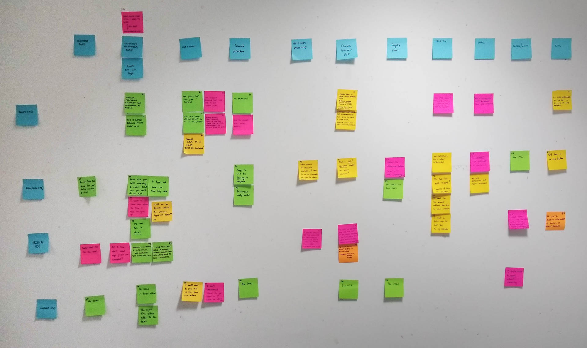
Here are some of our bigger findings.
Tiny changes can break big things
We wanted to improve the stop and think page, to make sure that users have an easy way to opt out of the emotionally demanding listener role even after selecting it. The user needs to read and acknowledge five statements, clicking the green button attached to each one.
Our modified design includes with some text at the bottom of the page that’s visible at all times, signposting non-listening roles:
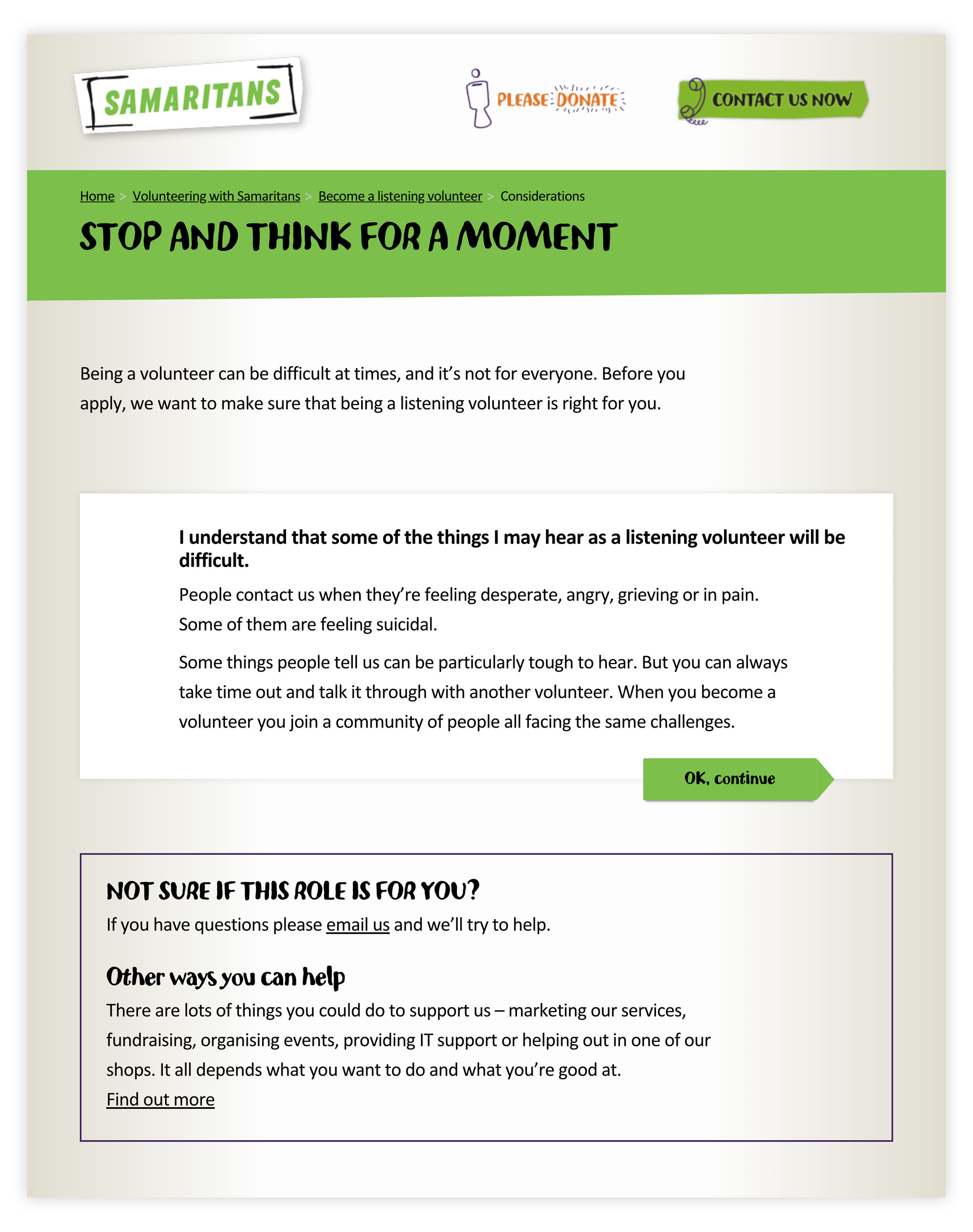
This seemed like a great solution, but we noticed that users got to the bottom of the page and became confused about where to head next, often missing the green buttons. Some users became stuck completely—unsure where to head next.
We need to refine this design to make sure that users can still make their way through without stumbling. We’ll look at the wording of the buttons first, and if that doesn’t fix the issue, we’ll revisit the design of the page.
Almost no one wants to cancel
We wanted to give volunteers an easy way to cancel interviews that they can’t attend, to save time for both interviewer and interviewee.
We’re providing ways to do this from reminder emails and SMS messages, but when we showed these to real users, we found that the option to cancel isn’t as valuble as the option to reschedule.
Most of the users we tested with were nervous about cancelling without knowing if there’d be another slot available to reschedule to. We need to make sure that information is presented early, so users can make a calm, informed choice to cancel.
People want to be told when to check back
At very busy times, users might find that there are no interview slots available at their chosen branch:
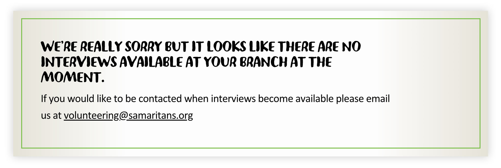
Because every branch is a little different, we can’t guarantee exactly when new interviews will be available.
This is difficult for users to deal with. We found they weren’t sure whether to check back in a day, a week, a month, or next year. We need to give a clearer idea of when they’ll be able to proceed in their journey to become a volunteer.
Technology breaks when you need it most
Some of our research participants took part remotely. We shared a computer screen with them and gave them control of the keyboard and mouse. We then observed the sessions and took notes from another room:
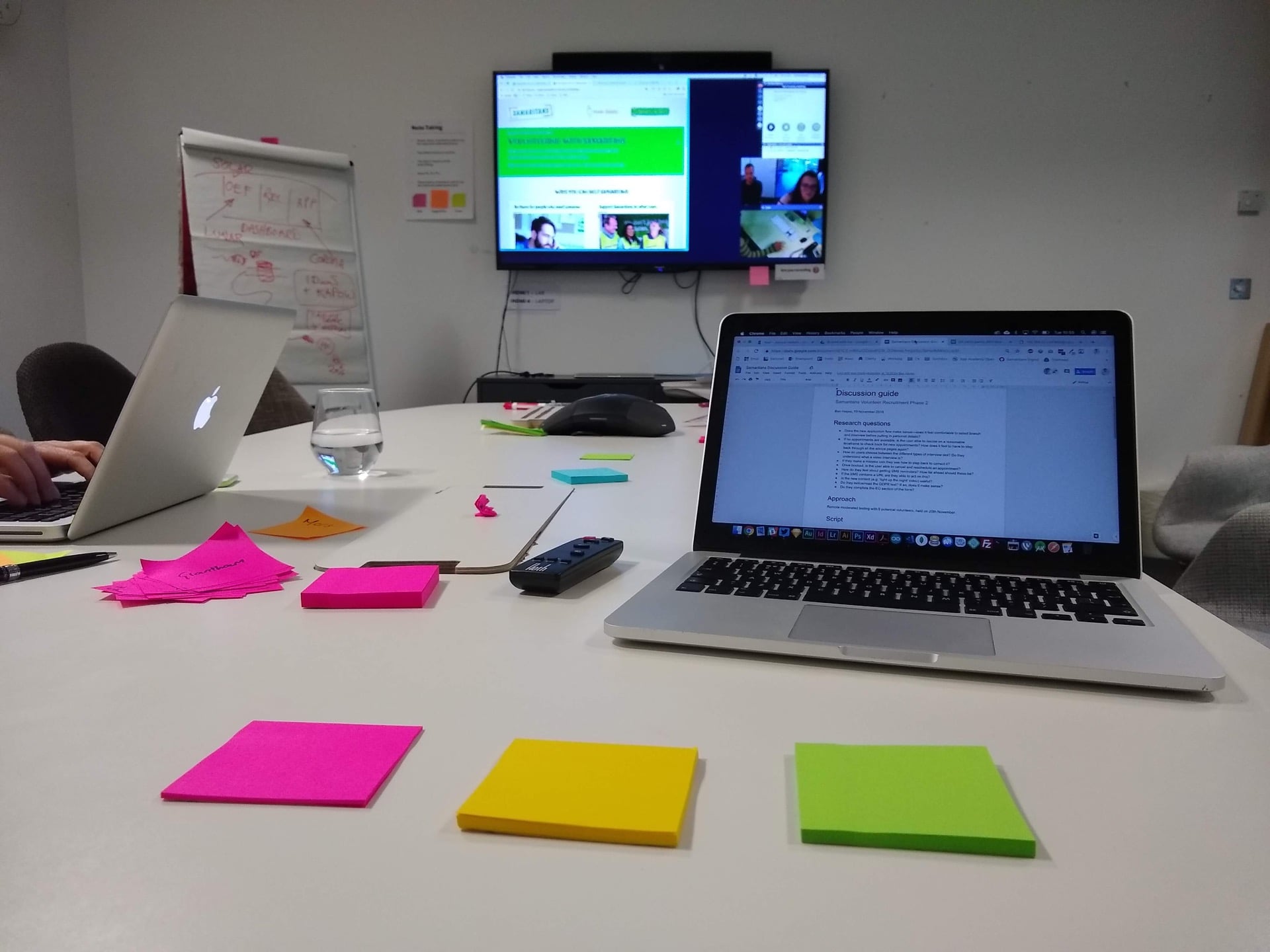
Remote participation lets us cover a much wider geographic area of the UK, but there are often unexpected issues with the technology. We need to respect the time of our participants, so dealing with bugs eats up precious minutes.
Whenever possible, it’s best to be in the same room as user research participants.
Further reading
- A guide to conducting user research in the public sector
- A beginner introduction to usability as a concept, and how to improve it through user research
If you found this useful, why not share it with someone?